
Choosing fabrics for quilts can be a fun experience, but so many times quilters are frustrated by this process. I am often asked about this while speaking to quilt groups. Just looking around a quilt shop can be a daunting challenge. Fabrics and prints catch the eye, but do they go together? Will these look good in a quilt? Maybe you need a particular color, but when you get it home it just doesn’t look right, and you cannot figure out why. That is the focus of this post today, how to choose colors and fabrics so you are confident your quilts will turn out the way you want. One note, the pictures may vary slightly in color from computer screen to computer screen, so keep that in mind if it is difficult to see the concept in the discussion. I have tried to make the illustrations as clear as possible.
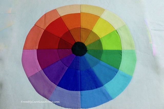
This will not be a dry recitation of color theory. You probably already know that red, blue and yellow are primary colors because they can be combined to make the other colors. Red and blue give you purple, as blue and yellow make green. Colors forming an equilateral triangle on the color wheel like red, yellow and blue are called triadic, and will go together well. Purple, orange and green are also triadic. But then there are complementary colors which are opposite each other on the wheel, like magenta and lime, and analogous colors next to each other within a base color like yellow-green, yellow and yellow-orange. It is great to understand the concepts, but it just doesn’t help much in the fabric store. Why is that? Because there is more to color than just color.
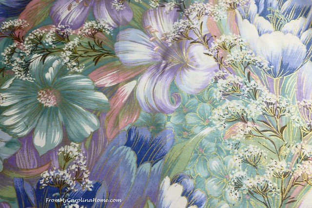
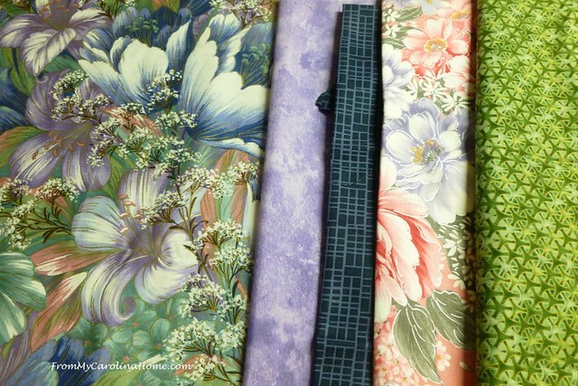
In order to match colors and fabrics well, you need to be able to see the colors within a color, or be able to see its ‘hue’. For example, have you ever tried to match a purple in the store? Hold it up against one fabric and it looks reddish, take it to another fabric and it looks more blue. Often a color will change based on what color it is next to. If the color is clear in hue, as opposed to muted, it will make a difference in what you choose to go with it. Muted colors look as if someone put grey in the color mix. This is called a tone. So let’s look at some examples, beginning with this pretty floral print with an Asian feel.
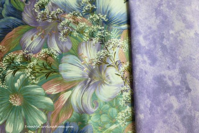
Suppose you want to have a purple print to go with it. This is the first one you see.

Can you see that the purple print has too much red for the Asian print? It is also a saturated color while the print is more of a tint, or pastel. Although it pulls out a bit of a reddish purple in the large flower, they just do not match. Can you see the bluish hue in the purple flower in the print? This is what I mean when I say to look for the colors within a color. This one is a better match, more harmonious with the print in tone and hue.
Now, lets add a few more fabrics, pulling out colors from the first print. This is a great way to match colors in the store. Simply choose a print you love and pull your other fabric colors from that print. In this example, the values of lights and darks are also already chosen, just match a pretty green to the medium green and a dark navy to that color. Note also that there is a large print, a small print, a tone on tone blender, and a linear design on the navy. This variety in scale is another way to make sure your fabrics work together well.
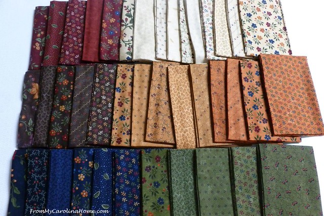
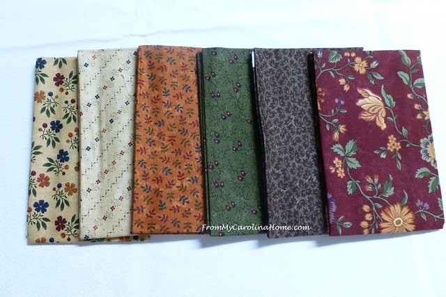
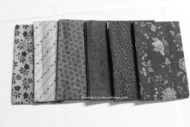
Most of the fabric manufacturers will have entire lines of fabrics that go together well, with colors that match across prints. Consider this line with red, purple, gold and off-white. There are different values in the colors, but the purples and reds all match in hue. Value is the quality of light or dark, and here some are lighter and some are darker. In the picture below, how many fabrics would you say are light, how many are medium and how many are dark?
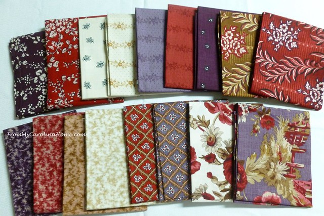
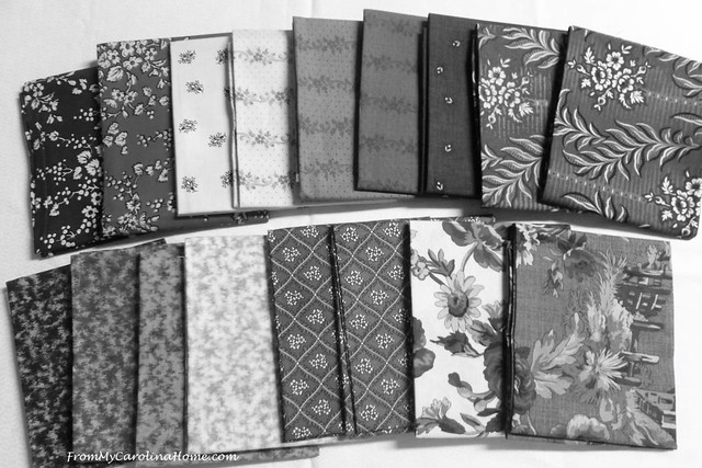
Most quilts look best with a variety of values, so how can you tell if a fabric reads light, medium or dark? The best way is to take a picture of the fabrics, and then turn the color down to make the picture black and white. You’ll see immediately that there are only two (maybe three) real darks in the line, four lights, and the rest of these fabrics are a medium value.
It is the contrast in light to dark, as well as the actual color that gives a combination interest. Consider this line, a lovely spring floral that I am using for the Scrap Dance Minuet Mystery. It looks like these will work nicely together, and they will, but they have one problem.
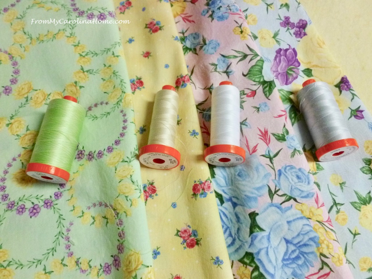
When you look at them in black and white, they are all almost exactly the same value. Sure, they can be used together, but I’ll make the background a pure white to add contrast and interest. Without any dark values, the final project will be what is called a ‘low volume’ design, which is fine. Sometimes that is what is wanted.
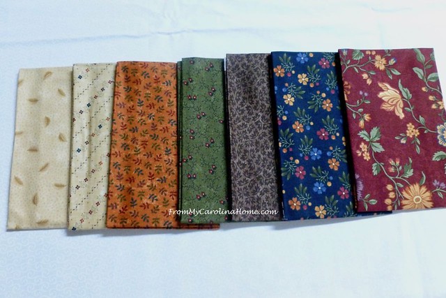
Some colors when put together will give a certain feel, such as seasonal colors. The group above is a good example of springtime. Now, consider this group, do you think they work well together?
Sure they do, they are an autumn palette all from the same line so the colors are an exact match. Plus there is a variety of scale of prints, both large and small. Can you tell if they will do well in a quilt for value? Let’s look at them in black and white.
Yes, this is a great combination, with light to dark values and a range of colors. This will make a lovely quilt with an autumn feel. But what if you like these colors but do not want an autumn quilt? Simply add some blue, as it will take the colors to more of a scrappy feel and less like an October day. To go even more scrappy and less autumn, replace the rust color background fabric with a gold, pulled from the blue or red background print.
These fabrics are very neutral in overall impression. They are all from the same line. The soft aqua goes well with the navy and ecru. A quilt with just these four fabrics will be nice, but it just needs some punch.
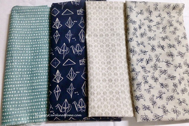
Just look what happens when we add a bit of red. The red is triadic from the navy blue on the color wheel, so it is a good choice for contrast. The red color pops and makes the whole collection more interesting.

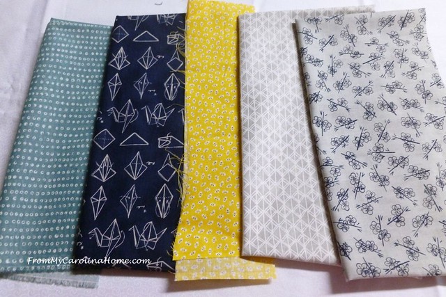
There are two lights, two mediums and a dark, a nice variety of values. So, you can feel confident that these will work together well. Adding a bit of yellow might be a nice pop of color too, as it is also triadic from the blue. So, consider this group. The yellow is muted, with some navy in the print. This works, the yellow is a good complement and will show up nicely, but not jump out.
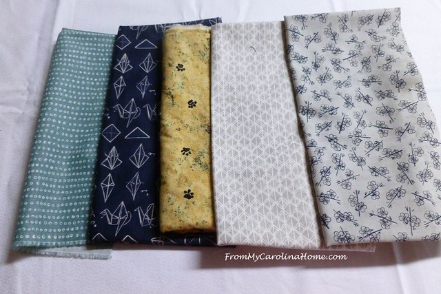
How about a brighter yellow, more of a clear hue than a muted one. This is OK, but I would consider the print too. The little chicks don’t really work well with the Asian feel of the other prints, with the origami crane in the navy print.

This fabric is a better choice, from a couple of vantage points. The scale of the print is smaller, a nice variety from the other prints. Also, the color is brighter and more clear, creating more contrast. Contrast is what provides movement to the eye in a quilt or project.
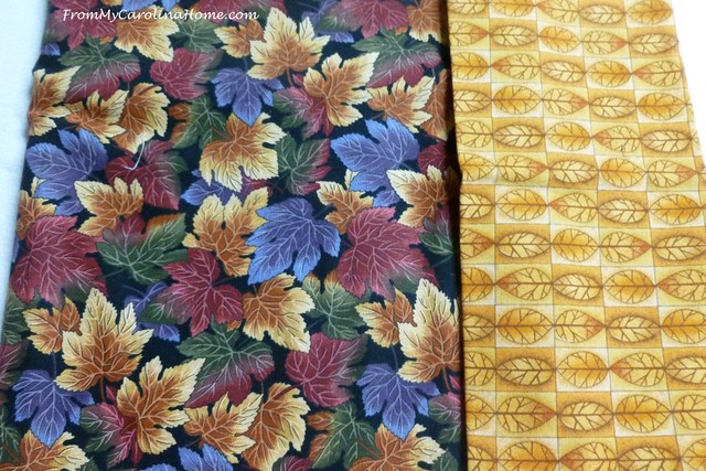
Let’s consider one more group. Long time readers know that I am addicted to autumn and often buy autumn prints. Consider these two prints, both autumn in feel with leaf prints. Do they work together?

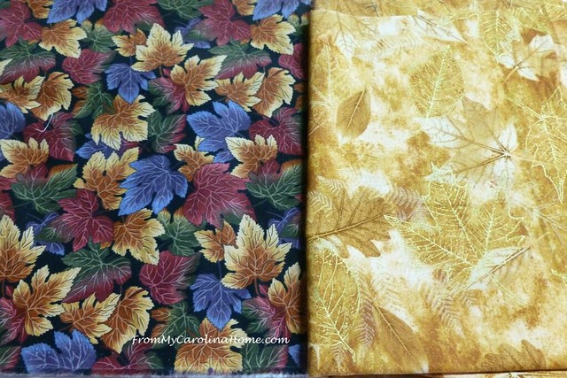
I would say no, they don’t. The print on the left is muted and doesn’t have any orange color, while the orange on the right is clear and bright in hue. It would be better to match the orange with a print that is closer to it in hue, meaning clear color with a similar saturation like this one in the middle below. Adding the gold on the right gives a contrast in value and scale.
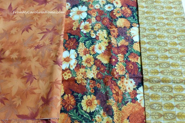
So what would go well with the first print? I begin by auditioning lighter golds. Yellows and golds can appear warm with an orange cast, or more cool with a bit of a greenish undertone. This one is OK, a different scale of print but a bit bright in hue. Yes, it is the same print as the one above, just a different hue. The one above leans to the greenish side of gold, while the one below leans to the orange side of gold.
The gold print below seems to be closer to the muted gold of the focus print. The scale of the print is similar, but is a tonal print, meaning all the same color with variations in value making it more of a blender print.
Now, how about a red. Reds can lean to the orange side or the purple side. This one is too bright being a clearer hue, more saturated in color, and leans to the orange side while the focus print is muted and leans toward purple.

Placing a few muted reds around the focus print, which do you like? Can you say why you like or don’t like them?
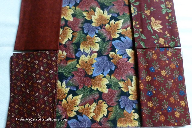
In the photo above, the ones on the left go really well. The larger print on the upper right is a possibility, but there are better choices on the left in terms of scale. The one in the lower right has a blue flower that really jumps out, or shouts ‘look at me’ too much. The eye goes right to that, and diminishes the focus print. Looking further in the stack of reds, I found this one below, a perfect choice. The red and green colors are a match in hue and intensity, the value is good, and the print is a different scale.
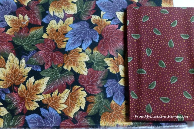
Adding a green/black check to pick up the black background of the focus print, and a light ecru for the quilt background, and I have a good variety of print scale, color, and value.

One more note about color, manufacturers tend to change their palettes every year. The lovely sage green in this year’s prints will be gone next year. Next year you might see a fern green, then the year after more of a clear grass green. Bottom line, when you see a print you love, get some additional prints to go with it right then. Even if the additional fabrics come from different manufacturer lines, the colors tend to be close within the same time period. Remember Avocado Green and Harvest Gold of the 70s, the Wedgewood Blue and Mauve of the 1980s, rich earth tones of the 1990s, clear primary colors in the early part of this century or the industrial neutrals of the modern quilt movement. Also, get a yard of background every time you buy fabrics, as colors of white tend to change too. Some years the whites will have a yellow cast, other times you’ll see more bluish tones. A clear bright white may not look good with a muted print that needs a softer ecru, and once again it is easier to match when purchased together.
In a nutshell, here is what to look for in three easy steps –
Choose a focus print to pull colors from
Match the hue and tone of your focus fabric
Create contrast with a variety of values and print size
Are you confident in choosing colors? Do you have any tips to add?
Fat Quarter Shop has 20% Off Basic of the Month, and the Notion of the Month, books and patterns too, plus check out the Daily Flash Sale – something new at clearance pricing every day!
Sharing – Threading Your Way,

This post is what I have needed for years! In simple language you have helped me understand color hues, tones etc. THANK YOU!
This post will be one I go back to over and over again Carole! Thank you for condensing one of your presentations into an outline we can refer to for a quick review. Your examples are just right for illustrating the points, and not too many, which can sometimes cause confusion or information overload, especially to the non-artistic , like me!!
Thank you…this post gives clear ideas and hints regarding color, print size and hue.. I can develop a better eye.
This is helpful. We can find all sorts of advice for choosing fabrics on the internets. Yours is very good. I agree with all of your matches. Some people have a better eye for choosing the right complimentary fabrics. Personally, I always have to go with “my gut” what looks good… kind of like Apple Pie and Broccoli? not so much. Apple Pie and ice cream, yes please.
Just kidding.
I have inherited compulsive indecision haha and then I waste a lot of time.
For me, it is good to practice putting colors together. Sometimes I do that when I am filing my fat quarters back onto their cute little shelves
Happy Friday Carole. I am staying home today. cleaning and sewing and perhaps a bit of trimming of branches
Thanks for this post on color. Very helpful! Can you write on this subject everyday for the rest of the year???
Thank You so much for this post. I love to sew and love to quilt and love to play with my fabrics which I have quite a lot. When I try to pull fabrics together from my years of stash buying I always have the problem of colors and prints going together. This helps a lot. As Pat says, you could go on and on with this post all year.
This is such a great post. Now I understand a little better, but will go back over this again and again I am sure. Thank you so much. And I hope your leg is healing. Have a great day
Great post Carole. There are times I spend more time picking colors, than sewing the top together. Then, of course, all that fabric has to go back on the shelves. lol
Excellent points and a terrific post! This was how I first learned to pick fabrics for a quilt. The only point I would add is I find when buying a full line of fabric—via FQ or precuts—manufacturers often forget the dark tones and overload us with mediums. We need that full range for a great palette.
Excellent lesson! Love how you show using a color wheel. This works for choosing any colors for your home, especially paint colors. Thanks for sharing!
I have been working on several different mystery quilts lately. They have been great for getting a better feel of color and fabric choices. Working with just basic guidelines for the fabrics such as scale and value without knowing what to expect in the end. I will have to remember to use the black and white photo trick, I often take a photo of my fabric selections, it gives a different perspective.
thank you for taking the time to do this. A ‘colour theory’ class is on my list of to do things.
It’s fun to see all your fabrics and great color theory lesson. Of course, we do the same thing with patterned papers, except they are so much cheaper than fabric!
I really enjoyed your post, thank you so much for sharing your insight with us. Most appreciated.
Good post!! Can you tell me why I don’t like white fabric with autumn colors, but cream feels right with autumn colors? Definitely saving this post to refer back to!
Yes, because autumn tones tend to be warm with yellow undertones, so the warmer lights like cream and ecru are more harmonious. A bright white will tend to the blue, or cool side, so it doesn’t seem to go well.
Thank you for the very informative post. I love love love the focus fabric in the last example. Do you remember when and where you got it? I would love to add a few yards to my stash. 🙂
Excellent post! While I can usually get the value balance close to where it needs to be, I needed this reminder to use the B & W photo option to perfect it. I love your tip about buying the background whites — I love scrappy backgrounds and after doing a few years of mystery quilts, I find I often don’t have the variety of tones I prefer. Some conscious stashing on each trip would help flesh that out!
Wonderful post, it can be hard to pick the right fabrics to go along together. Thanks for all the tips!
You elucidated that nicely. I pick according to what I like, and they look good together, but I couldn’t tell you why, and don’t worry about it a lot. I simply look for what pleases me. In your examples, I was in agreement with you everywhere, except maybe once, but I’m not seeing the actual fabrics. This was fun to read, because you are so good at saying the things I know and use without being able to say them.
Good afternoon Carole,
Absolutely love the choosing of colors lesson, thank you so much for the time and effort you took to show and tell how to choose the fabrics. So many books don’t go into the choosing like you have.
The color wheel is a help as far as choosing colors that go together but they don’t go into the different hues and proper colors that will work together and you have done a wonderful lesson for that step,
Thank you so much for all your time sharing this valuable info.
Phyllis
What a wealth of information, Carole, and explained so well. I know what works when I by chance strike the right combinations together. But pulling from my stash, or the fabric store, can often result in fabrics that are not quite right. I’ll be referring back to this! Thank you! Showcased today…