
One thing about quilting for charity is the need never ends. There are so many worthy causes to give to, and it gets hard to decide what to do next. It has been pointed out several times that the most difficult quilts to get donated are the ones suitable for an older boy. It is easy to do toddler prints, and girlie stuff. But there are older boys on the list too, often overlooked. So, that is my focus for the next couple of quilts. I am going to do larger ones suitable for an older boy, or young man.
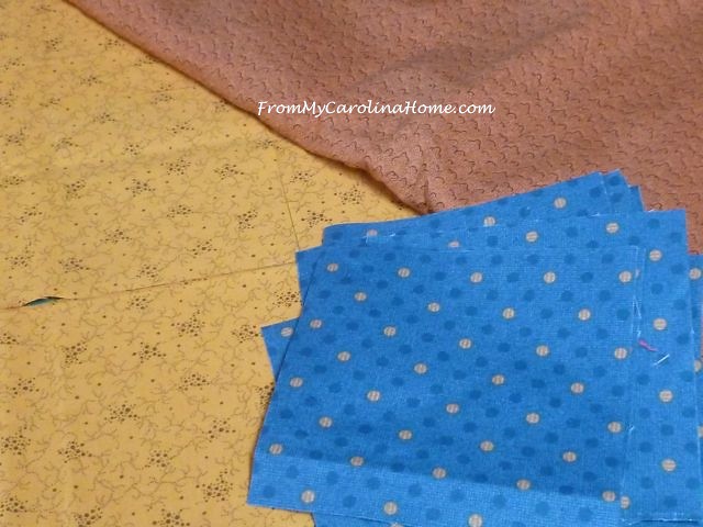
My biggest problem with that is in fabric. My stash is heavy Thimbleberries, florals and darks, lots of autumn colors, much too adult for my purposes, or too girlie. These fabrics were more generic, just some dots and swirls.
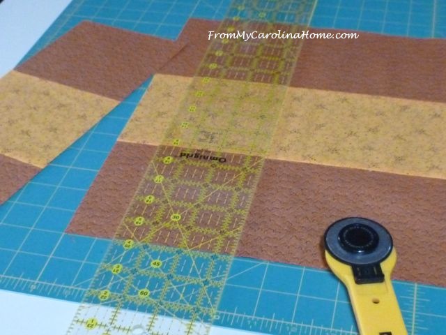
There was only enough blue for the center patch, so I cut 12. I cut 24 gold ones for either side and sewed those rows. They are five inch squares.
Ok, you know I usually show you my boo-boos. Here’s another. When I got to the end I was one short, yet I knew I had cut the right number. Get out the ripper, I sewed two golds to one blue. Ugh!!
Got that straightened out, and completed the center rows for the blocks.
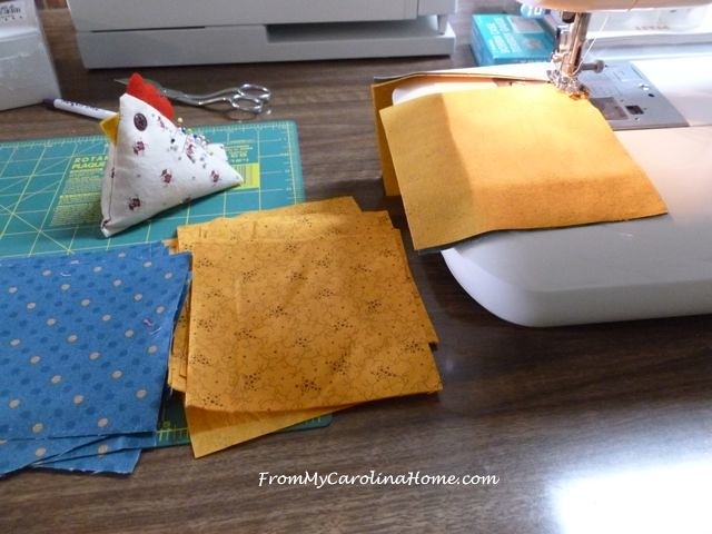
The gold and brown rows went much faster, as I could sew entire width of fabric in rows. I used 5 inch wide strips.

Then I cut the sections into five inch strips.
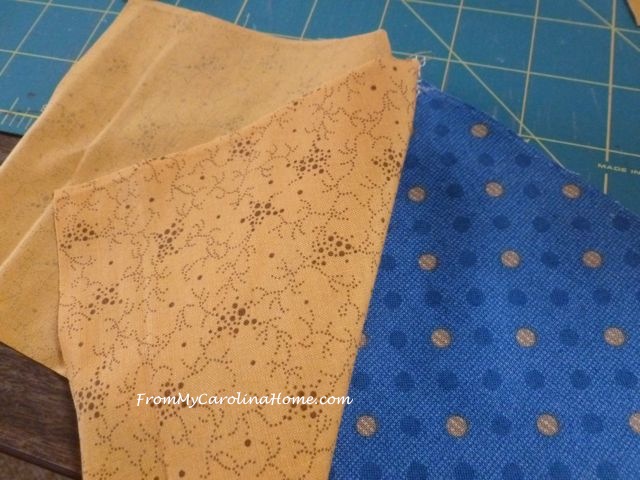
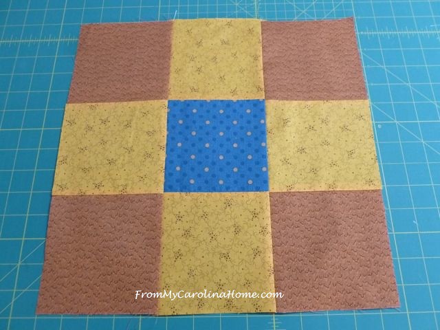
I pressed all toward the gold so I had nicely nesting seams.

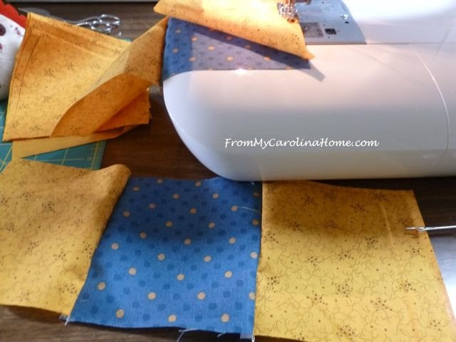
Here is the nine-patch block.
Cut and turned in the usual manner.
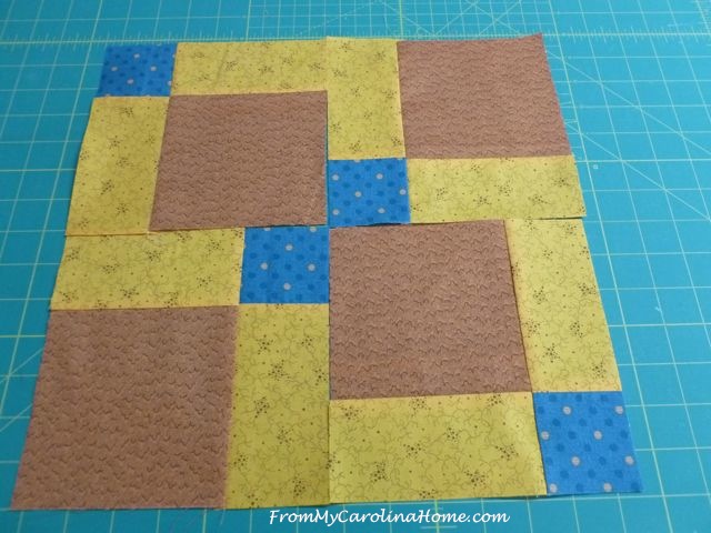
Sewn one at a time. I tend to get wonky blocks if I try to chain piece at this stage.
The blocks were sewn into four groups of three blocks.
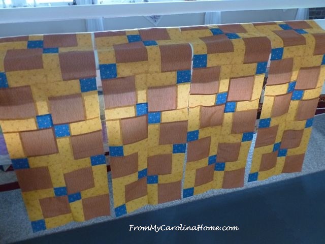
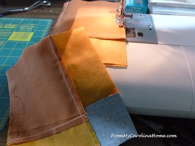
Then the rows were sewn together. And now, a decision to be made.

I don’t have enough of the blue with the dots left to do a border. I do have these other blues.

Neither one is an exact match for color. I also have enough of the brown, but I think that would be too much brown.
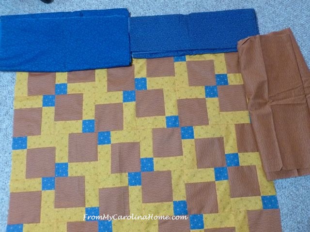
Which do you like?
See part 2 here.

The blue is good. Thanks for making these. As you say, there is always need.
Either blue would work, for sure. I prefer the one on the right, it appears slightly darker. Lovely quilt. I have just used this same design in a baby quilt in pinks and greys.
I prefer the blue – could you not sew strips of both blues together for a more casual binding? Thanks for your tutorial.
I like the brighter blue. The one on the left in the photo. I have committed to making 4 quilts for Christmas for my Brother and his three sons. What a time I had coming up with something. I’m almost finished, But I sure wish I had seen this post months ago. Nice job.
I like the blue on the left. the print on it seems more masculine to me and not as fussy as the one on the right.
Blue for sure. Like Carol, the blue on the left. I know what my son would call that color of brown. Not nice, so blue for sure. Thanks for all you do.
Perhaps a thin inner border of brown with wider outer border of blue would frame it up and tie it together nicely. Some young man will really enjoy this quilt!
I like the blue. Either look good to me, but I prefer the one on the left. The design seems slightly less girly, though it’s really just in comparison.
I prefer the blue on the right, it is a tighter design and less girly. Carole, what if you did just a small strip of the blue and then added the brown as the outer border. Just a thought. I think it is fabulous that you are doing these quilts for charity and especially for an older boy, because you are so right not enough people make for this older gender. Thanks for sharing and inspiring. Have a wonderful creative day!
I will have all of step 4 done in a few hours and move on to step 5! I am loving the process of revealing this mystery. My hubby said last night that he is excited to see the final results of what everyone did to see what types of varieties are used. He is a wonderful supporter of my quilting adventures. Will post photos later today also!
So great of you to make quilts for specific needs. I like the blue on the left for the border – it feels darker and more masculine. I feel a brown border would make the whole quilt look a little dark/dull. Love D9P patterns!!
I would use both-put the brown not so wide next to the blocks and the not so matched blue on the outside.
Hi Carole, I’m Carol with no “e” My group makes lots of charity quilts, and we often use scrappy borders made of the leftover or similar fabrics. It looks fine, also uses up some of the stash instead of leaving more to deal with later! Just sew random lengths of the width you want for borders in all the colors of blue and brown you have left. I also use leftovers to piece bindings and backings. (Can you tell I’m a Bonnie Hunter fan?) LOL! Don’t forget to watch her Quiltcam tonight at 8 eastern. Carol (in Arkansas)
The blue one
Great variety of ideas, it would be fun to see them all mocked up together. I prefer the blue on the left, but like the suggestion of a narrow inner brown border, maybe with a scrappy wider blue of both options, or border of the one and binding of the other… Good color pull from stash for a ‘hard to make for’ age range. Good reminder about such a versatile pattern, too.
Both blues would be fine, but I prefer the blue on the right.
I just love how the blocks seem to float. SMILES!
I like the one on the left. Looks less like flowers. I love the quilt! Hugs,
I like either blue, but if you want to put some extra time (like you have so much) how about wide “piano keys” with the brown and the blue on the border???? Put a narrow blue or brown inner border and then piano keys for outer border????
I vote for the blue fabrics, I think either would be good but I would go with the one on the left.
How about one of the blues as an outer border plus a smaller inner border of the brown. Maybe the brown for binding too. Great looking quilt!